F1 Race Data

2025
Type
Data Visualization
Client
Solo Project
Info
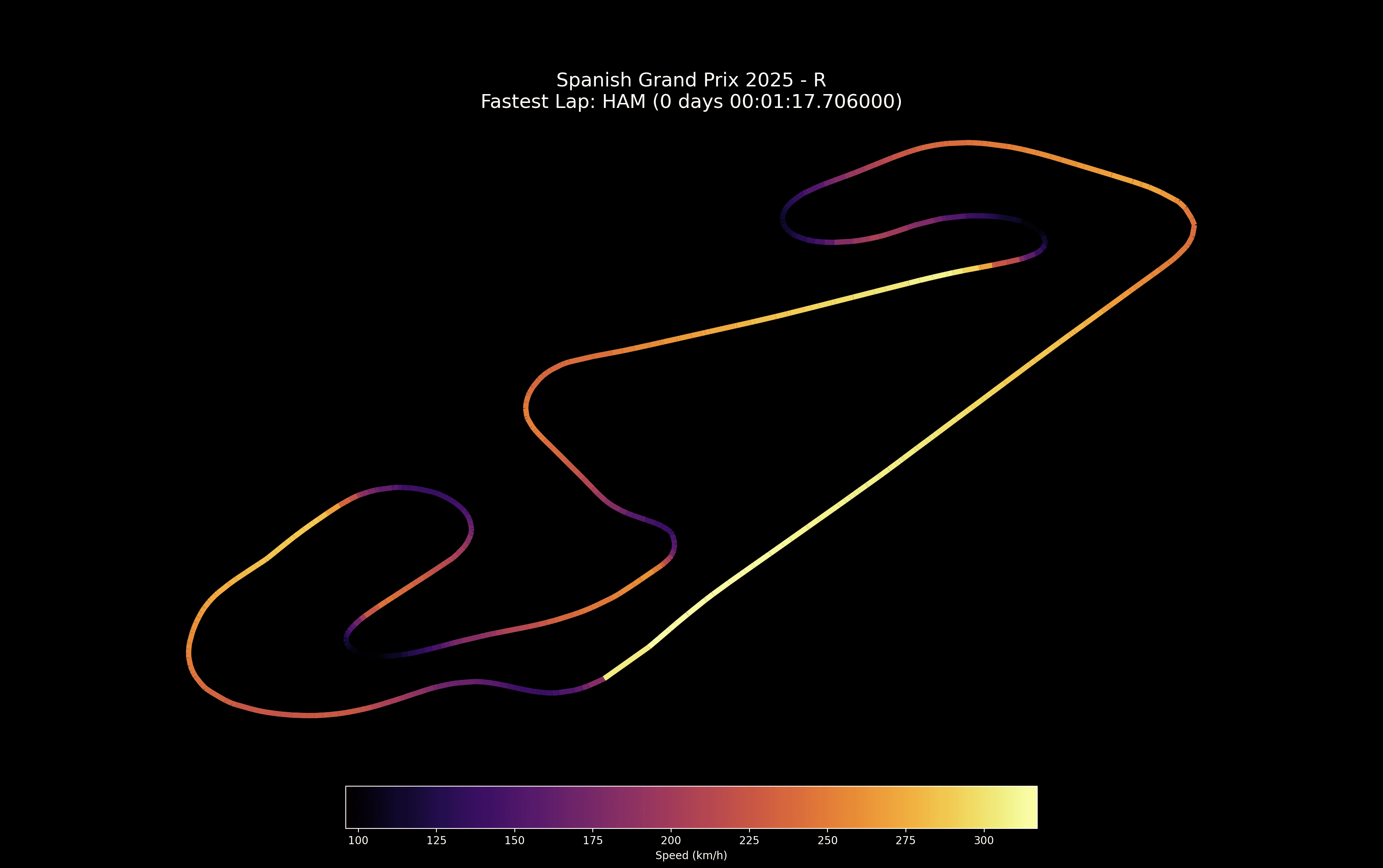
A fun data visualization project built with FastF1, Matplotlib, and NumPy.
The project visualizes Lewis Hamilton’s fastest lap during a Formula 1 race, displaying the track path as a heatmapwhere color intensity represents the car’s speed at different points.
By processing telemetry data and lap information from the official timing API, this visualization transforms raw race data into an , data-driven graphic offering insights into braking zones, acceleration points, and overall lap dynamics.
import fastf1 as f1